
Decide between a restaurant app and website for your Harrogate business. Discover which digital move drives sales and engagement first.

Discover the main outdated website risks for North Yorkshire businesses and how fixing them can restore visibility, build trust, and drive more sales.

Learn practical steps to improve AI search optimisation and stay visible as more UK customers turn to generative tools for answers.

Improve your website's visibility with responsive layouts, fast loading times, and conversion-focused features that help businesses in Leeds and Harrogate grow online sales.

Discover how an integrated approach to digital marketing can help your Yorkshire SME increase sales and improve efficiency in 2026.

Discover how mastering online reputation builds trust and drives sales for Yorkshire SMEs with strategies that deliver results.
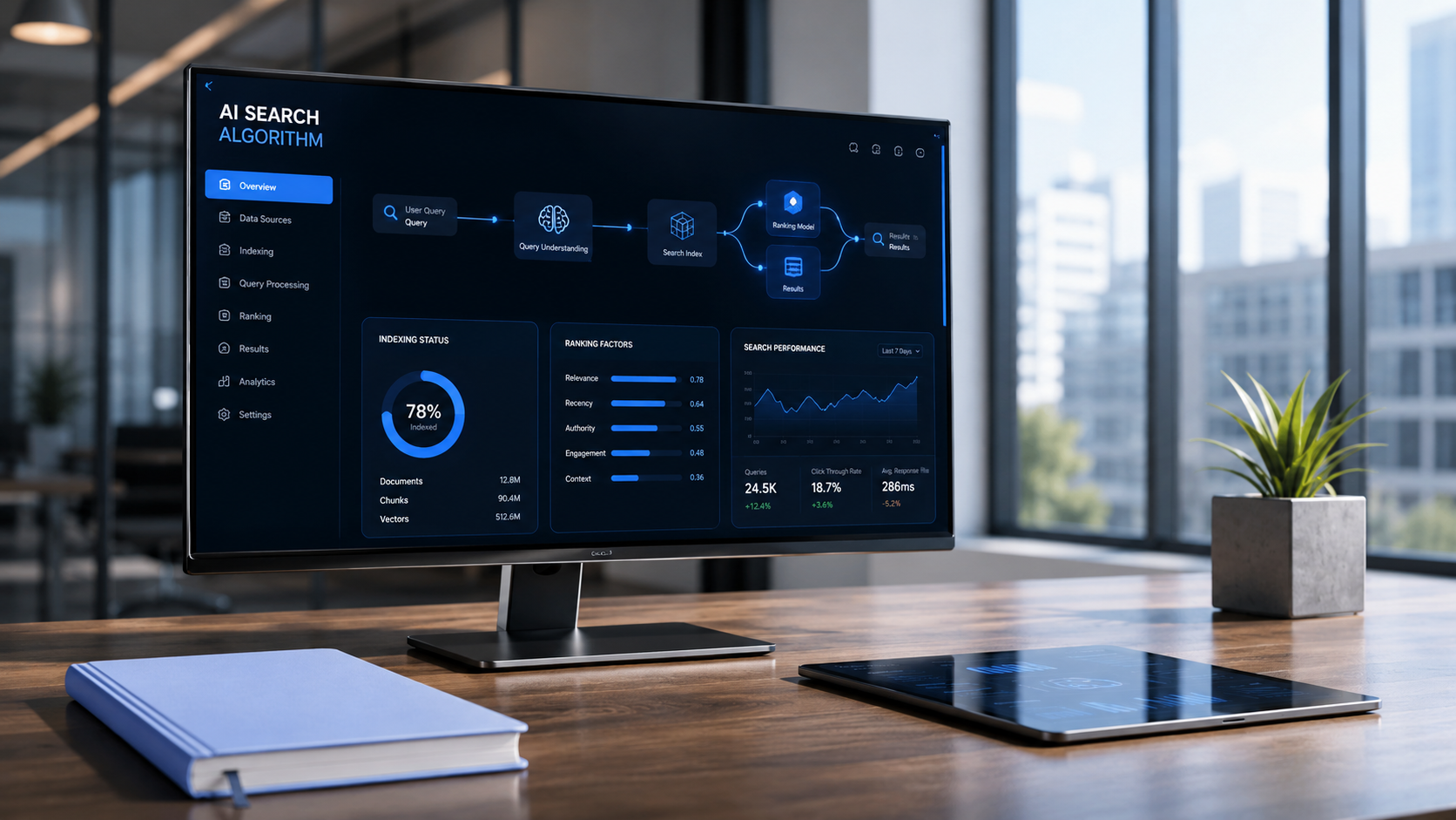
Discover how AI search helps Yorkshire businesses improve visibility, build trust, and increase sales through practical GEO strategies.

Learn how generative AI search is changing online discovery and get practical steps to make your business visible, relevant, and trusted in 2026.

Master website conversion optimisation to boost sales for your Yorkshire business. Discover strategies that increase website leads and improve your sales funnel in 2026.

Discover how to drive increased sales with Cutting Edge Digital's holistic strategies. Boost online sales growth, e-commerce conversion, and revenue for your Yorkshire business in 2026.